
Inspiration: Posters of Last 50 Years
Graphic Design USA Magazine put together a list of posters of the last 50 years and asked their readers which were their favorites. It’s interesting to see what made the […]
Graphic Design USA Magazine put together a list of posters of the last 50 years and asked their readers which were their favorites. It’s interesting to see what made the […]
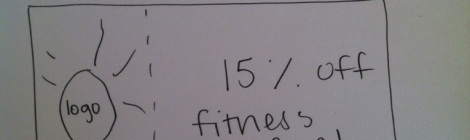
I decided to go with coupons for my design because I wanted to make something would feel the most useful for the Arbutus Senior Center. ASC can use these coupons […]

For the three shirts that I designed, I wanted to make them as universally wearable as possible (meaning: anyone no matter what your age or sex could wear them without […]

When working on my website wireframes for the Arbutus Senior Center, I was not exactly sure where to start and how much detail I should put into the wireframes. Should […]

Some identity systems that I thought were interesting were the Smithsonian Institute, Macy’s, and Best Buy. Smithsonian has a great logo and color scheme for showing people that this is […]

For the Arbutus Senior Center, I took the three different layouts (the business card, letterhead and envelope) as simple designs for printing and large distribution. I did not want the […]

In “Non-designers Type and Print Book” I liked the beginning when they talked about using a second color sparingly on a business card. Throwing it all over the business card […]

Some important points that I got out of the reading, Scale, from the book “Graphic Design: The New Basics” were that all design pieces use some sort of scale. It […]
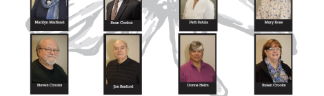
My two different designs for the ASC Board of Directors took quite some time. Arrange the images into the layout and making sure all were similar sizes was very difficult […]

Since these may be printed, I chose to create it in black and white to keep down printing costs.
